Ring around the shower stall

Hey Modern Nesters,

I am going to work Modern Nesters into ground, until you submit :)

Today we are going to talk about tile ribbons in showers.

ScreenHunter_3333 Jun. 22 18.40.jpg

I am just going to rip the band-aid off and just say. I think this is so cheesy and it looks cheap. I realize people are on a budget but find a tile you love that you can afford. This does not fool anyone. I encourage you to get creative. If you can’t afford to tile your entire bathroom, just do a feature wall and the side walls can be a complimentary tile.

ScreenHunter_3333 Jun. 22 18.42.jpg

This looks expensive and intentional. It creates focus and a “wow” moment.

ScreenHunter_3333 Jun. 22 18.43.jpg

This client wanted the ring around the shower and I convinced her to tile the whole back wall. It unifies the back wall. Sure it cost more, but it looks great. If money is a concern, find a tile you love that you can afford. A 6 inch ribbon of something you love looks like you gave up. Go to that extra tile store and hunt, this is something that you are going to use every day, make it special. You deserve it. My goal as a designer is to find surface materials that are affordable but make an impact.

What drives you crazy? Let me know.

Until next time,

Michael.

Add some Style to Subway Tile

Hey Modern Nesters

I hope you enjoyed my poetic title to my blog and it rhymes too! Today we are going to talk about subway tile.

The first images that come to mind when I think of subway tile is a Brew Pub or a Starbucks knock off.  It is used a lot and mostly because it is a very affordable option, usually a few dollars a square foot. 

I am going to be honest, subway tile is not my favorite tile but it is an affordable option and there are ways to take this overused material and make it unique, special and thoughtful.  

You can play with the placement of the subway tiles to create interest.

THIS LOOK IS ACHIEVEDWITH SIMPLE SUBWAY TILE,4X4’S AND A LINER

THIS LOOK IS ACHIEVED

WITH SIMPLE SUBWAY TILE,

4X4’S AND A LINER

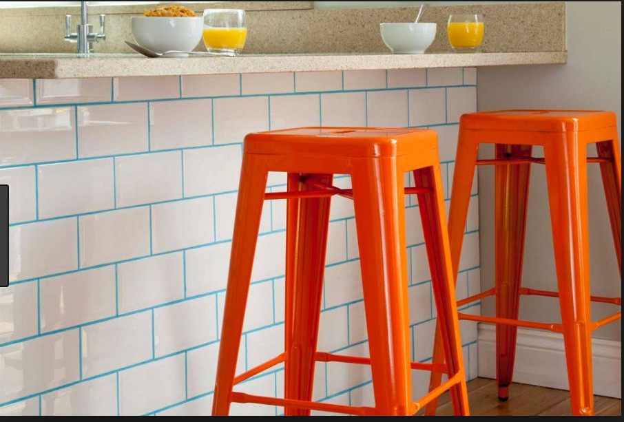
Or if you are more adventurous, you can play with the color of the grout

Blue is a bit adventurous but adarker grout can add some life

Blue is a bit adventurous but a

darker grout can add some life

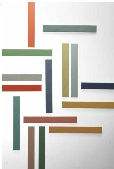
Subway tile does not need to be white. This tile staggered in thirds, not in halves.  Also, peppering in additional colors, brings more life to the pattern

The traditional subway tile found at Home Depot and the like is usually 2” x 4”.  A way to bring something fresh to this shape is the play with proportions.  This example is 2” x 15”.  It feels more modern and the texture on the tile adds depth.

rEALLY MODERN ELONGATED SHAPE

rEALLY MODERN ELONGATED SHAPE

On a recent project, I played with different sizes and added some deco tiles into the mix to add interest. Laying out these patterns is time consuming but worth it

Kitchen_3_021.jpg

My suggestion is to personalize your space and have some fun with it. Hope you saw subway tile in a new light.

Until next time Modern Nesters, Michael sighing off.

Avoid Online Design Disasters

Hey Modern Nesters! 

Beyonce has the beehive…alright, I know I am not Beyonce but give me a little latitude. 

This week we are going to talk about online shopping.  The internet is great and opens you up to so many products you would not be able to source locally and all from the comfort of your own home.  But buyer beware.  Just like online dating, the items look great in the photos but when you get them in your home, it is a whole other story.  What looks like beautiful walnut wood grain is a piece of MDF with a vinyl wood sticker on top of it.  YUCK! 

Here are the advantages of online shopping

Great Prices

Ease of Sourcing

Unlimited options

Disadvantages

Hard to get a sense of the scale of items

Quality of manufacturing

Color of finishes.

Here are some of suggestions to minimize the cons of online shopping

1.    Check their return policy

·       What are the return shipping costs?

·       I bought a duvet on Etsy from Ukraine and it was super affordable.  I could return it but the shipping back there was more than the duvet itself.

·       A way to avoid some of these issues.

·       See if you can order a sample of the finishes or the fabric that comes with the item you are purchasing

2.    Read the description carefully

·       Pictures can be deceiving

·       For instance, in the photo the metal finish on the chandelier looks black

·  But it is really oil rubbed bronze which is a brown black

ScreenHunter_3313 Jun. 05 10.45.jpg

3.    Look at the dimensions -  Goldilocks took 3 tries to get it just right.  Here is a way to avoid that pitfall.

·       When you see the item all by itself on the screen, it looks huge and then you get it home and it the wrong size. 

·  Look at the measurements and compare them to existing items in your home. 

ScreenHunter_3313 Jun. 05 10.44.jpg

4.    Rugs 

·       These can be sourced affordably online but the colors can vary widely

·       Many online stores will send a sample for a nominal cost

·  If not, buy the smallest size rug as a sample. 

·       It is a lot easier to return and shipping costs are minimized.

5.    Buying Vintage Items online

·       Many times all sales are final. 

·       “Excellent Vintage Condition” is what I say in my online dating profile but there are still some cracks in the façade.

·  If you want perfection – vintage items may not be the right solution for you.

I am not saying not to buy things online but be smart about it.

Have you had any online issues when buying stuff online?  Feel free to share them here and help your fellow Modern Nesters.  I am going to try to make Modern Nesters work like Gretchen Weiners tried to make “Fetch” happen. 

Until next week.

M

Bear with me

As I try to catch up with the whirl of social media. Hopefully you can teach an old dog new tricks.

bear photo large.jpg

Welcome to Modern Nest

If you are here, you are contemplating change.  Congratulations!  Many view design as superficial, I see it as transformative. I see time and time again how a well-designed space changes how clients live for the better.  As a designer, my goal is to strike a balance between form and function.  I have learned to gauge that balance in my nine years of professional practice in interior design and in my pursuit of a Master’s Degree in interior architecture.

Each project is a journey, your journey.  You are an integral part of the process.  My intention is for your home to feel like YOUR home and not a magazine spread or a design trend that is super implanted onto your space.  You have a voice that needs to be expressed and your home has say in the matter too.  My objective is to synthesize these voices and create a cohesive whole.

This site highlights my past work as well as a blog that highlights my passion for design.   If you are ready to take a leap, I am here to guide you through the process.


Services Provided

Bathroom Design, Bedroom Design, Color Consulting, Custom Bathroom Vanities, Custom Bookcases, Custom Built-ins, Custom Cabinets, Custom Fireplace Mantels, Custom Furniture, Custom Kitchen Cabinets, Dining Room Design, Furniture Selection, Holiday Decorating, Home Office Design, Interior Design, Kids Bedroom Design, Kitchen Design, Kitchen Remodeling, Laundry Room Design, Living Room Design, Nursery Design, Playroom Design, Space Planning, Sustainable Design


Areas Served

Beverly Hills, Hollywood, Los Angeles, Pasadena, Vernon, Silver Lake, Boyle Heights, Eagle Rock, Echo Park, Calabasas, Encino, Hidden Hills, San Fernando, Topanga, Van Nuys, Woodland Hills, Brentwood, Bel Air, Pacific Palisades


Certifications and Awards

LEEP, AP ID + C